A weak caption rarely fails loudly. It just quietly reduces reach, lowers saves, shortens watch time, and gives people no reason to react. That is what makes caption mistakes so expensive. Most creators and brands do not lose engagement because they are posting terrible visuals. They lose it because the caption does not deepen the post, sharpen the message, or move the audience toward action.
Good captions do three jobs at once. They stop the scroll after the visual has earned a second glance. They give the audience a reason to care. And they make the next action feel natural, whether that action is a comment, a save, a share, a follow, or a click. When captions miss one of those jobs, engagement usually drops.
The Quick Reality Check
| Caption mistake | What it usually looks like | What it damages | Better approach |
| Weak opening line | Starts with context instead of tension | Read time, completion, comments | Lead with the strongest idea first |
| Repeating the visual | Caption says exactly what the image/video already shows | Saves, shares, perceived value | Add meaning, context, story, or takeaway |
| Generic wording | “So excited to share this” or “What do you think?” | Comments, trust, memorability | Be specific, useful, and audience-focused |
| No structure | Long block of text with no rhythm | Readability, retention | Use short paragraphs, line breaks, clean flow |
| Wrong CTA | Asks for comments that do not fit the post | Interaction quality | Match the CTA to the content type |
| Too broad | Tries to say everything at once | Clarity, message retention | Build around one core point |
| Tone mismatch | Serious topic written like a trend post | Trust, brand fit | Match tone to audience intent |
| No payoff | Hook promises something but caption delivers nothing practical | Saves, follows, loyalty | Reward attention with substance |
Why Captions Still Matter More Than Many Creators Think

A common mistake in social strategy is treating the caption like leftover space beneath the post. That is backwards. On most platforms, the visual gets attention, but the caption shapes interpretation. It tells people what they are supposed to notice, what the point is, and whether this post is worth interacting with.
This matters even more now because feeds are crowded with polished content. When every other reel has decent editing and every carousel looks reasonably clean, the difference often shifts from design quality to message quality. Captions become the layer that creates relevance. They can turn a nice-looking post into a useful one, a vague post into a sharp one, and a forgettable post into something worth saving or sharing.
The strongest captions do not just accompany content. They complete it.
Mistake 1: Starting Too Late
One of the biggest engagement killers is wasting the first line. Many captions begin with warm-up language such as “Hey guys,” “Happy Monday,” “I wanted to share,” or “A few thoughts on this.” None of that gives the audience a reason to continue reading. The opening line is valuable real estate, and too many captions spend it on throat-clearing.
People do not decide whether to engage after reading your full caption. They decide much earlier. Often, they decide after the first sentence. That means the first line has to carry tension, clarity, curiosity, utility, or emotional relevance. It should signal value immediately.
A better opening line sounds like a point, not a preface. Instead of saying, “I wanted to talk about why content isn’t working,” say, “Your content may not be underperforming because of reach. It may be underperforming because the message is too easy to ignore.” The second version creates a reason to continue because it introduces a sharper idea.
The first line should not merely introduce the topic. It should frame the problem.
Mistake 2: Using the Caption to Repeat What the Post Already Says
If the visual already communicates the core idea, the caption should not simply repeat it in a longer form. A reel showing a productivity hack does not need a caption like, “Here is a productivity hack I use every day.” A carousel about branding does not need a caption that just restates the slide titles. That only adds length without adding value.
This is one of the quickest ways to reduce saves and shares. People save posts that give them useful framing, and they share posts that help them express an idea more clearly than they could on their own. When a caption only echoes what is already visible, it feels disposable.
The caption should add one or more missing layers, such as:
● Why the idea actually matters
● Where most creators get it wrong
● When the tactic works and when it fails
● What nuance or practical takeaway people often overlook
In other words, the caption should answer the question the audience asks after seeing the post: “Okay, and what should I actually do with this?”
When the visual delivers the headline, the caption should deliver the insight.
Mistake 3: Writing From the Brand’s Point of View Instead of the Reader’s
Many low-performing captions are centered on the creator’s feelings, process, excitement, or announcement, even when the audience needs interpretation, relevance, or help. There is nothing wrong with personality, but audience attention increases when people feel the post is about them, not about the account publishing it.
This is why captions filled with “we’re thrilled,” “we’re excited,” and “we just launched” often underperform unless there is already strong brand demand. Those phrases describe your internal enthusiasm, not the external value to the audience. Unless the reader already cares deeply, your excitement alone is not enough.
Reframing helps. Instead of “We just launched our new caption planner,” write, “If you keep posting consistently but still feel your captions sound flat, this solves the planning gap most creators ignore.” That version translates the update into an audience problem and a practical benefit.
Readers engage when they see themselves in the caption. That means your wording should reflect their friction, their hesitation, their goals, and their language.
Mistake 4: Trying to Make One Caption Do Too Much
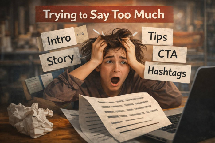
A caption is not a mini website, a brand manifesto, a full tutorial, and a personal diary all at once. When a caption tries to do too many jobs, it loses sharpness. The result is usually a post that feels crowded, unfocused, and forgettable.
This happens often when creators are afraid to leave anything out. They begin with a hook, add a backstory, explain the process, mention the lesson, insert a CTA, add hashtags, and then pile on unrelated tips. The caption gets longer, but not more persuasive.
Strong captions usually work best when they revolve around one clear goal, such as:
● Reframing a problem
● Adding depth to the visual
● Starting a conversation
● Driving a click or action
Once that purpose is clear, the rest of the caption becomes much easier to shape. Every paragraph should support that purpose. Anything that does not support it usually weakens clarity.
Focus is one of the most underrated forms of engagement strategy. People are far more likely to respond to a clear message than a crowded one.
Mistake 5: Writing Captions With No Rhythm or Readability
A strong idea can still underperform when the caption is physically hard to read. Huge text blocks, no spacing, poor pacing, and abrupt transitions create friction. On mobile, friction kills attention fast.
Readability is not only a formatting issue. It is also a thinking issue. Captions with good rhythm feel guided. One line opens the tension. The next line expands it. The next line adds proof, detail, or contrast. Then the caption lands on a natural close or CTA. This creates momentum.
Poorly structured captions feel like someone dumped thoughts into the description box without editing. That makes even useful content feel heavier than it is. If the post requires more than a glance, the writing has to carry the reader smoothly.
Here is a simple way to think about caption flow:
| Caption part | Job it should do | Common mistake |
| Opening line | Create immediate relevance or curiosity | Starts with filler |
| Expansion | Explain the problem, insight, or story | Becomes vague or repetitive |
| Payoff | Give the reader the useful part | Delivers no real takeaway |
| CTA or close | Guide the next action naturally | Forces an awkward question |
Short paragraphs, clean transitions, and deliberate sequencing make captions easier to finish. And finished captions tend to produce stronger interaction than captions people abandon halfway through.
Mistake 6: Using Lazy CTAs That Do Not Match the Post
A lot of engagement advice has taught creators to ask questions on every post. That has produced a flood of weak CTAs like “Thoughts?” “Agree?” “What do you think?” or “Tell me below.” These are not automatically bad, but most of the time they are too broad to create meaningful replies.
People respond when the invitation feels easy, specific, and worth answering. A generic question creates work for the audience because they have to figure out what kind of answer you want. A specific prompt reduces that effort.
For example, if the post is about caption writing, asking “Which one do you struggle with most: writing the hook, staying concise, or ending with a CTA?” is much stronger than “What do you think about captions?” The first prompt narrows the response path. The second one leaves too much open.
The CTA also has to fit the content type. Educational posts are often better optimized for saves and shares than comments. Opinion posts may invite discussion. Personal stories may invite resonance. Product posts may invite clicks. If you keep asking for comments under content designed for saves, you create a mismatch between the post’s natural value and the requested action.
Good CTAs feel like the next step in the conversation, not a forced engagement trick.
Mistake 7: Sounding Generic When the Topic Requires Specificity
Specificity is one of the clearest signals of quality. Generic captions sound like they could belong to anyone, while strong captions feel rooted in a real observation, a real friction point, or a real lesson. That difference affects trust immediately.
Compare “Consistency matters on social media” with “Posting regularly helps, but consistency without a recognizable point of view just trains your audience to ignore you on schedule.” The second version is more engaging because it moves beyond the obvious and brings a clear angle.
Specificity also strengthens performance in a few important ways:
● It makes ideas more memorable
● It gives people something more useful to save
● It makes phrasing more shareable and quotable
● It strengthens your positioning through depth
If your caption could sit under almost any post in your niche, it is probably too generic.
Mistake 8: Ignoring Audience Awareness

Not every follower is equally informed, equally ready, or equally interested. A caption written for people who already understand the problem will fall flat if most viewers are still at the awareness stage. On the other hand, a caption that explains basic concepts to a highly informed audience may feel slow and obvious.
This is where many captions lose engagement without the creator realizing why. The problem is not always the writing quality. Sometimes the problem is the audience stage mismatch.
If the audience is problem-aware but not solution-aware, the caption should focus on naming the pain clearly. If the audience already knows the solution category, the caption should focus on differentiation, tradeoffs, or proof. If the audience already trusts the creator, the caption can move faster and assume more shared context.
The more accurately a caption meets the reader where they are, the more natural engagement becomes.
Mistake 9: Stuffing the Bottom With Clutter
Even though hashtags and keywords can still have contextual value, many captions are weakened by clutter at the bottom. A thoughtful caption followed by an untidy pile of tags, repeated phrases, or awkward keyword stuffing can reduce the sense of polish.
This matters because engagement is partly emotional and aesthetic. People do not only react to the message. They react to how composed the whole post feels. Clutter signals low editorial control.
Keywords should feel integrated, not bolted on. Hashtags should be selective, relevant, and secondary to message quality. If the bottom half of your caption looks like an SEO scrap pile, the writing above it loses force.
A clean caption feels more intentional. Intentional writing usually performs better than desperate writing.
Mistake 10: Forgetting That Different Content Types Need Different Caption Strategies
A reel, carousel, founder post, meme, product demo, case study, and educational tip should not all use the same caption logic. But many accounts apply the same formula everywhere. That flattens performance because each format creates a different kind of audience expectation.
A carousel often benefits from a caption that expands one key lesson or frames who the content is for. A reel may need a shorter, sharper caption because much of the context is already inside the video. A founder post may perform better with a personal insight and a narrower CTA. A product post may need more proof and less hype.
This is why copying caption templates across every post type rarely works for long. Consistency matters, but sameness hurts.
| Content type | What the audience usually wants | Caption strategy that works better |
| Educational carousel | Context, takeaway, save value | Expand the lesson and make the practical use clear |
| Short reel | Fast framing, one key idea | Use a sharp hook and concise reinforcement |
| Personal story post | Authenticity, relevance, reflection | Share the lesson, not just the event |
| Product or offer post | Clarity, trust, proof | Focus on the problem solved and who it helps |
| Opinion post | Strong angle, conversation | Take a position and ask a specific follow-up |
How to Audit a Caption Before You Publish It
Before posting, it helps to pressure-test the caption like an editor rather than a creator. Most bad captions survive because nobody checks whether the writing actually earns attention. A quick audit can catch that.
Ask whether the first line contains tension or just context. Ask whether the caption adds something the visual does not. Ask whether one clear point dominates the message. Ask whether the CTA feels natural for the post. Ask whether a real person would save, share, or reply after reading it. If the answer is unclear, the caption probably needs rewriting.
Here is a simple review framework:
| Audit question | If the answer is no | What to fix |
| Does the first line create interest immediately? | The caption starts flat | Rewrite the opening with a stronger point |
| Does the caption add value beyond the visual? | It feels repetitive | Add explanation, nuance, or takeaway |
| Is there one clear message? | It feels scattered | Remove side points and tighten the angle |
| Is the writing easy to scan on mobile? | It looks dense | Break paragraphs and improve flow |
| Does the CTA match the post’s purpose? | Interaction feels forced | Change the ask to suit saves, shares, or comments |
A Practical Rewrite Example
Sometimes the easiest way to understand caption quality is to compare a weak version with a stronger version.
| Weak caption | Stronger rewrite |
| “New post is live. Sharing some caption tips that have helped me. Let me know what you think.” | “Most captions do not fail because they are too short. They fail because they say nothing people want to carry with them. If your posts get views but not saves, your caption may be the problem.” |
| “So excited to launch this new resource for creators.” | “If writing captions feels harder than making the post itself, this resource is built for that exact bottleneck.” |
| “Consistency is key.” | “Consistency helps, but repetitive messaging teaches your audience to scroll past you faster.” |
The stronger versions work better because they create friction, name a problem, and make the audience feel seen.
The Better Standard for Captions
The best captions are not the longest, smartest, or most poetic. They are the ones that make the content more useful, more precise, and more worth acting on. That is the real standard.
If a caption improves clarity, deepens relevance, and gives the audience an obvious next step, engagement usually follows. Not every post will explode, and not every good caption will go viral. But strong caption writing consistently improves the quality of attention you earn. And quality of attention matters more than vanity metrics.
A high-performing caption usually does not feel like a trick. It feels like sharp communication. It respects the reader’s time, rewards their attention, and makes the message easier to remember.
Final Verdict
Caption mistakes kill engagement when they create friction without payoff. Weak openings lose attention. Repetitive wording removes value. Generic phrasing weakens trust. Poor structure reduces completion. Forced CTAs drain response quality. And clutter makes the whole post feel less intentional.
The fix is not to write longer captions or copy formulas more aggressively. The fix is to write with more precision. Start faster. Focus harder. Add value the visual does not already deliver. And make the next action feel natural.
That is what good captions do. They do not decorate the post. They complete the post.
A Short Takeaway Table
| If your captions are getting | The likely issue | First thing to improve |
| Views but low saves | Not enough practical payoff | Add clearer value and specificity |
| Likes but low comments | CTA is weak or too broad | Ask narrower, easier questions |
| Reach but low follows | Message lacks point of view | Sharpen the angle and audience fit |
| Good visuals but weak overall response | Caption repeats the post | Add context, meaning, or insight |