MagFuseHub.com looks polished enough to suggest a full digital magazine. The navigation is clean, the categories are broad, and the structure gives the impression of a website built to cover modern internet interests at scale.
But the more time spent on the site, the clearer its real behavior becomes. This is not a tightly edited publication with deep topic authority in every section; it behaves more like a search-first content hub that wants wide coverage, simple discoverability, and room to publish across multiple niches.
A Website That Looks Bigger Than It Feels
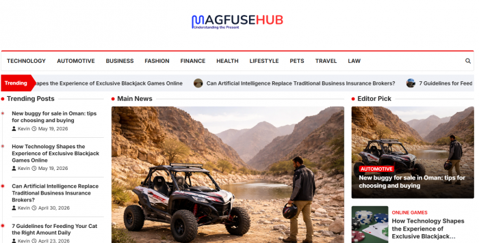
The homepage and menu architecture are designed to create confidence. Ten categories appear in the top navigation: Technology, Automotive, Business, Fashion, Finance, Health, Lifestyle, Pets, Travel, and Law which immediately frames the site as a broad, magazine-style destination.
That first impression matters because it signals ambition. A visitor expects a balanced content operation where each section has enough substance to justify its place in the menu. On MagFuseHub, though, the structure often feels more complete than the underlying editorial library.
Category Behavior Tells the Real Story
The clearest way to understand MagFuseHub.com is to look at how its sections behave, not just how they are labeled. Some categories show clear signs of activity, while others feel like placeholders waiting for future content or one-off publishing opportunities.
| Category | Observed state | What it suggests |
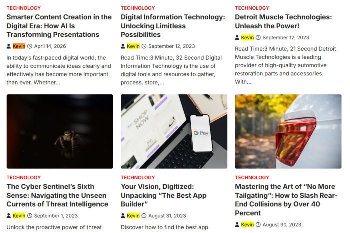
| Technology | Active, with visible article activity | A core category used to support broader search reach |
| Automotive | Present, but not discussed as a standout active section | Included for breadth more than visible editorial momentum |
| Business | Active enough to support the site's multi-topic positioning | One of the practical pillars of the site's generalist strategy |
| Fashion | Empty or near-empty | A category created in advance without meaningful execution yet |
| Finance | Present and relevant to the site's broad topic mix, but not strongly authority-led | Useful for search coverage, weaker for trust-sensitive publishing |
| Health | Present within the site structure, but with limited visible expert signaling | A risky category to scale without stronger author credibility |
| Lifestyle | One of the more natural fits for the site's readable, generalist style | Supports easy informational content and broad audience traffic |
| Pets | Reported as one of the most active sections | Likely a priority bucket where publishing is more consistent |
| Travel | Thin, with only a few posts | A live section in name, but not yet a deep content vertical |
| Law | Empty or near-empty | A placeholder category that currently weakens the authority impression |
This pattern reveals more than a simple content gap. It suggests the site was built around category readiness first, with the expectation that content could be filled in later depending on demand, keyword opportunity, or publishing needs.
The Writing Is Easy to Read, but Rarely Distinctive
MagFuseHub.com 's writing style is functional and readable. Articles tend to use short intros, clear subheadings, familiar informational structures, and language that is simple enough for general readers to skim comfortably.
That readability works in the site's favor. A casual visitor can land on a post and quickly grasp the main idea without pushing through dense jargon or editorial theatrics.
The limitation is that the content often feels generic. Many pieces appear written to satisfy a search query efficiently rather than to express a strong point of view, demonstrate hands-on expertise, or offer original reporting.
This gives the site a consistent voice, but not a memorable one. The articles are serviceable, yet they rarely create the sense that a domain specialist is behind the page.
User Experience Is Clean, Not Curated
As a browsing experience, MagFuseHub.com is uncomplicated. The menu is obvious, article pages follow a stable template, and the overall journey is easy for first-time users to understand.
That kind of usability matters because many content sites overcomplicate navigation in the pursuit of growth. MagFuseHub.com avoids that mistake. It behaves like a site designed to help users reach a page fast and read without much friction.
Still, the experience feels flat rather than editorially crafted. There is little sign of guided topic journeys, curated series, or stronger internal pathways that turn separate posts into a more thoughtful reading ecosystem.
| UX area | What works | What feels missing |
| Navigation | Clear top menu and familiar category structure | Limited sense of hierarchy within categories |
| Article layout | Readable templates and predictable page flow | Little differentiation between ordinary and high-value content |
| Reader journey | Easy to move page to page | Weak curation and few signs of deep editorial planning |
Author Identity: The “Kevin” Question
One name appears again and again across MagFuseHub.com’s articles: “Kevin.” On the surface, that consistency might look like a personal brand, but the site does little to unpack who Kevin is or what domains he actually specialises in. There is no prominent author page, no clear biography linking Kevin to specific qualifications, and no obvious signal that one person can credibly cover everything from pets and lifestyle to finance, health, and law.
That lack of author detail gives the byline a placeholder feel rather than the weight of a recognisable expert. Readers who care about who is behind the words are left guessing: is this a single writer with broad interests, a generic name used for multiple contributors, or simply a house byline attached to centrally managed content? Until the site offers clearer author information, the “Kevin” signature functions more as a label than as a trust anchor.
Trust, Transparency and Reliability
Trust on MagFuseHub.com sits in an awkward middle zone. On one hand, the site behaves like a normal content platform: pages load, navigation works, and the structure is easy to understand. On the other hand, key transparency elements are either thin or missing. Ownership is not heavily foregrounded, editorial leadership is not clearly introduced, and author credentials are barely visible. That makes it harder for readers to gauge who is ultimately responsible for what appears on the site.
This becomes more important in trust-sensitive categories such as finance, health, and law, where readers reasonably expect clear expertise and accountability. MagFuseHub’s articles in these areas are readable and structurally sound, but the site does not consistently show its homework in terms of author identity, real-world experience, or strong sourcing. As a result, the platform works best as a secondary reference useful for orientation and basic explanations rather than as a primary authority for decisions where accuracy, depth, and professional-level reliability truly matter.
Search-First Strategy Is Visible Everywhere
MagFuseHub.com behaves like a site built for discoverability first. Its broad categories, accessible article structures, and uneven yet expandable topic map all point toward a search-first publishing model rather than a deeply mission-driven editorial model.
That is not automatically a flaw. Search-first websites can still be useful, practical, and commercially smart. In MagFuseHub's case, this strategy explains both its biggest advantage and its biggest limitation: the site is flexible enough to publish across many niches, but that same flexibility makes it feel less anchored in a clear identity.
The result is a domain that seems more interested in being broadly available to many topics than in becoming the obvious authority in a smaller number of them.
What the Website Does Well
MagFuseHub.com works best when judged for what it actually is, not for what its category count implies. It is easy to browse, readable, broad in scope, and structurally ready to accommodate many different content themes.
Those qualities give it practical value. Users who want quick explanations, skimmable content, and simple navigation can get a decent experience, especially in the site's more active sections.
Where the Site Still Falls Short
The biggest weakness is uneven execution. Empty or thin sections make the site feel unfinished, while generic writing and limited author transparency make it harder to trust the site as a destination for serious research or expert interpretation.
A second issue is editorial identity. The site has structure, but it does not yet have the kind of topic depth, author clarity, or publishing consistency that turns a broad content platform into a genuinely respected digital brand.
Verdict
MagFuseHub.com is a functional, search-first content website with a broad layout and a readable user experience. Its strongest qualities are accessibility, topical flexibility, and a structure that makes casual browsing easy.
Its real limitations are equally visible: uneven category depth, weak expertise signaling, and a general sense that the site was built to cover many topics before it was ready to do all of them well.
For everyday browsing and light informational reading, MagFuseHub.com is usable and reasonably clear. For readers seeking strong authority, consistent editorial depth, and high-confidence expertise, it still feels like a growing content hub rather than a fully established publication.