NewsFlashBurst.com presents itself as a fast-moving information website, but its strongest signals point in a different direction. The site has a broad menu, a simple article layout, and multiple topic categories, yet the missing author details, thin footer, empty Entertainment section, irregular posting pattern, and trading-related content make it worth reviewing carefully before treating it as a reliable source.
This is not a site that looks completely inactive or unusable. It has readable articles and a working structure. The question is whether the site gives readers enough transparency, depth, and editorial consistency to support the kind of content it publishes.
The Site at a Glance
| Area Checked | What Stands Out |
| Site identity | Broad content website with a news-style name |
| Main content areas | Business, Education, Entertainment, Fashion, Finance, General, Life Style, Travel |
| Empty category | Entertainment appears listed but not populated |
| Writing pattern | Simple explainers written for search traffic |
| Publishing rhythm | Uneven, with visible gaps between posts |
| Author information | No proper author profiles visible |
| Trust pages | About Us and Contact information are not clearly visible |
| Footer behavior | Thin footer with social links and promotional-style linked ad |
| Higher-risk content | Finance and trading-related articles |
| Overall reading | Better suited for casual browsing than high-trust research |
What NewsFlashBurst.com Actually Feels Like
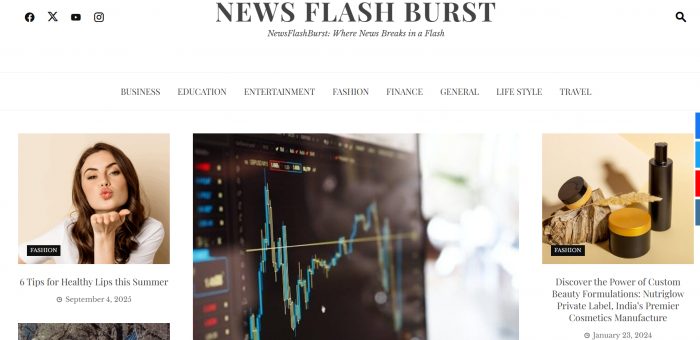
NewsFlashBurst.com has the surface structure of a digital magazine. It uses category navigation, article cards, dates, and homepage sections that make it easy for readers to move from one topic to another. The site does not require login access, so the reading experience is frictionless.
The content mix, however, feels closer to a general blog than a focused news site. It moves from finance and trading to beauty, lifestyle, travel, education, and profile-style articles. That range can work when a publication has a strong editorial team behind it, but NewsFlashBurst.com does not clearly show that support system.
The site feels like it was built to cover many searchable topics rather than develop strong authority in one category. That is not automatically negative, but it changes how readers should use the site. It may help someone understand a basic topic quickly, but it does not consistently look like a place for expert interpretation or decision-making guidance.
The Category System Looks Wider Than the Content Library
One of the first things to notice is the category structure. NewsFlashBurst.com lists eight visible categories: Business, Education, Entertainment, Fashion, Finance, General, Life Style, and Travel. This gives the site a wide editorial shape.
The issue is that the Entertainment category appears empty. A visible category with no published posts makes the site feel unfinished. It also weakens confidence in the way the site is maintained.
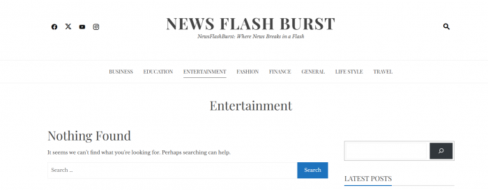
A category menu should reflect active content areas. If a website lists a major section, readers expect to find articles inside it. When that section returns no content, it suggests one of three things: the site is still under development, the publishing plan is incomplete, or the category was created for future keyword expansion before the content was ready.
For a small blog, this may be understandable. For a site presenting itself as a broad information platform, it becomes a visible editorial gap.
The Homepage Feels More Template-Led Than Curated
The homepage layout is another area where NewsFlashBurst.com feels uneven. It uses several content blocks that resemble a news template, including sections such as trending, latest, editorial-style picks, and topic-based blocks.
The problem is that some articles appear repeatedly across different parts of the homepage. This repetition makes the site feel less curated. A strong homepage usually guides readers through distinct sections with different editorial priorities. NewsFlashBurst.com appears to reuse the same limited set of posts in multiple places.
That does not prevent the site from being readable, but it affects the first impression. The homepage gives the shape of a larger publication without showing enough content depth to fully support that layout.
It also creates category confusion. If finance, lifestyle, or general articles appear in sections that do not naturally match them, readers may question whether the site is being edited carefully or simply using a prebuilt layout.
Publishing Consistency Is Not Strong
A major weakness is publishing consistency. The visible post dates suggest that NewsFlashBurst.com does not follow a steady publishing schedule. Some articles appear from early 2024, while others are from much later in 2025. The gaps between posts make the site feel lightly maintained rather than actively updated.
This matters because publishing rhythm is one of the easiest ways to judge whether a website is alive and editorially managed. A news-style site usually has regular updates, active categories, and fresh posts across its main sections. NewsFlashBurst.com does not show that kind of pace.
Some articles also appear with updated dates, which can be a good sign when updates are meaningful. But the site does not clearly explain what changed in those updates. Without a short update note, readers cannot know whether the article was revised with new information or simply refreshed.
The result is an uncertain freshness signal. Dates are visible, but the publishing pattern does not create strong confidence.
The Writing Style Is Clear, but Not Deep
The writing on NewsFlashBurst.com is easy to follow. Most articles appear written for general readers, with simple introductions, direct explanations, and familiar subheadings. That makes the content accessible.
The limitation is depth. The site’s articles often explain a topic at a surface level, but they do not consistently show original reporting, expert commentary, hands-on experience, verified data, or detailed source comparison. The writing style is closer to search-result answering than editorial analysis.
That is especially noticeable in higher-trust categories. A finance article should do more than explain basic benefits. It should discuss risk, limitations, real-world examples, regulatory context, and source quality. A travel article should clearly separate official policy from general guidance. A health-adjacent lifestyle article should avoid sounding medically confident unless it is backed by proper expertise.
NewsFlashBurst.com is readable, but readability alone is not the same as authority.
Trading Articles Raise the Standard Readers Should Apply

The site includes finance and trading-related content, including a visible article about spot trading. This matters because trading is a higher-risk subject. Readers may use this type of content to understand money decisions, market behavior, or investment-related ideas.
The trading content appears beginner-friendly. It explains the topic in accessible language and focuses on basic advantages. That may be useful for someone who wants a light introduction.
But trading content needs stronger guardrails. A reliable finance article should clearly explain downside risk, market volatility, leverage concerns, platform risk, taxation issues, and why readers should not treat general information as personal financial advice. It should also show who wrote the piece and why that person is qualified to discuss the subject.
NewsFlashBurst.com does not provide enough visible author or editorial context around this type of content. That makes the finance section one of the most important areas to approach carefully.
Author Transparency Is One of the Biggest Weaknesses
NewsFlashBurst.com does not appear to show proper author profiles. This is a serious gap because the site covers topics where the writer’s background matters.
A proper author profile should tell readers who wrote the article, what experience the writer has, what topics they usually cover, and whether they have any relevant expertise. This is especially important for finance, travel, education, and health-adjacent lifestyle content.
Without author profiles, the content becomes less accountable. Readers cannot easily check the writer’s qualifications, previous work, or subject knowledge. They also cannot tell whether the article was written by a specialist, a general contributor, or a content producer without direct expertise.
This does not prove that the articles are inaccurate. It simply means the site does not give readers enough reason to trust the content as expert-led.
About, Contact and Policy Signals Are Too Thin
The lack of visible trust pages is another important issue. A reliable content website usually makes basic information easy to find: About Us, Contact Us, Privacy Policy, Terms, editorial standards, correction policy, and sometimes advertising disclosure.
NewsFlashBurst.com does not clearly surface these elements. That leaves readers without answers to basic questions:
● Who runs the site?
● Who edits the content?
● How can readers contact the team?
● How are mistakes corrected?
● Are ads, affiliate links, or promotional placements disclosed?
These are not minor details. They are part of the trust layer that separates a casual blog from a serious publication. When those pages are missing or difficult to find, readers have less information about accountability.
The Footer Feels More Promotional Than Informational
The footer is usually where a website gives readers its most important trust links. NewsFlashBurst.com’s footer appears thin. It includes basic copyright information and social-follow links, but it does not clearly offer the kind of transparency pages readers normally expect.
Another noticeable detail is the promotional-style linked ad in the footer. A footer ad is not automatically a problem. Many websites use seasonal promotions, affiliate links, and advertising placements.

The issue is balance. On NewsFlashBurst.com, the promotional element is more visible than the site’s trust information. When a website lacks proper author profiles, About details, Contact information, and policy links, a promotional footer link can make the site feel more monetization-focused than reader-focused.
The footer does not create the whole trust problem, but it reinforces it.
Strengths and Limitations
| Strengths | Limitations |
| The site is easy to browse without account creation. | No proper author profiles are clearly visible. |
| The articles are written in simple, readable language. | The content often lacks expert depth and original insight. |
| The site covers multiple popular topics. | The broad category spread weakens niche authority. |
| Dates appear on visible posts. | Publishing consistency appears irregular. |
| The layout is familiar for blog readers. | Homepage sections feel repetitive and template-led. |
| Finance and trading topics may help beginners understand basic concepts. | Trading content lacks strong visible risk framing, author credentials, and editorial review signals. |
| The category menu gives the site a broad structure. | The Entertainment category appears empty. |
| Social-follow links are present in the footer. | About, Contact, policy, and editorial transparency signals are weak. |
E-E-A-T Review
| E-E-A-T Area | Site Signal | Assessment |
| Experience | Little visible first-hand reporting, testing, or direct experience | Weak |
| Expertise | No proper author profiles or visible credentials | Weak to moderate |
| Authoritativeness | Broad content mix without a clear specialist identity | Weak |
| Trustworthiness | Missing or unclear About, Contact, policy, and editorial information | Weak |
The most important weakness is trustworthiness. The site may publish readable content, but it does not clearly show who is responsible for it. That matters more when the site publishes finance and trading-related articles.
Experience and expertise are also limited because articles do not strongly show first-hand knowledge, expert review, or author background. Authoritativeness is weak because the site covers many topics without building a clear reputation in one area.
Reader Risk by Topic
| Topic Area | Risk Level | How Readers Should Use It |
| Fashion and lifestyle | Low to moderate | Fine for casual reading, but still check specific claims. |
| Travel | Moderate | Verify booking rules, airline policies, and fees with official sources. |
| Education | Moderate | Use as a starting point, not as a final source. |
| Finance and trading | High | Do not treat as financial advice. Verify with expert and official sources. |
| Health-adjacent lifestyle | Moderate to high | Check medical or wellness claims with qualified sources. |
This is the most practical way to read NewsFlashBurst.com. Not every article carries the same level of risk. A lifestyle tip is very different from a trading explanation. The more a topic can affect money, health, travel, or personal decisions, the more carefully readers should verify it.
Is NewsFlashBurst.com Search-First?
NewsFlashBurst.com appears to be search-first in its structure and writing pattern. The site covers many unrelated topics, uses simple explainer-style articles, has broad categories, and does not show strong signs of original reporting or editorial specialization.
A search-first site is usually built to answer many common queries. That can make it useful for quick browsing, but it does not automatically make it authoritative.
NewsFlashBurst.com fits that pattern. It seems designed to cover searchable subjects across finance, fashion, travel, lifestyle, education, and general topics. The content is accessible, but the site does not show enough depth or transparency to be treated as a high-authority publication.
Who Should Be Careful With the Site?
Casual readers can use NewsFlashBurst.com for light reading and basic explanations. The site is simple to access and the articles are easy to understand.
Readers looking at finance or trading content should be much more careful. These articles should be treated as general information, not investment guidance.
Travel readers should verify policies through official airline or booking sources, especially if the article discusses name changes, fees, documents, or procedures.
Advertisers, guest-post buyers, and potential partners should also review the site carefully before making decisions. They should check real traffic quality, indexing, disclosure practices, content freshness, and whether the site provides enough transparency to support its claims.
Final Verdict
NewsFlashBurst.com is best described as a broad, search-first content blog with a news-style presentation. It has readable articles, a simple layout, and multiple categories, but it does not show enough editorial transparency or consistency to be treated as a strong authority source.
The biggest concerns are the missing author profiles, unclear About and Contact information, thin policy visibility, empty Entertainment category, inconsistent publishing pattern, repeated homepage blocks, limited sourcing depth, and BFCM promotional-style footer link.
The site may be useful for casual browsing, but readers should not rely on it alone for finance, trading, travel policy, education, or health-adjacent decisions. For important topics, NewsFlashBurst.com should be treated as a starting point, not a final source.